
Visual & Web Design
Skipr is a local tourism website created as part of an entrepreneurship class in collaboration with a colleague. I served as the co-founder and lead visual designer, responsible for shaping the platform's branding and user experience. The project was developed to provide travelers with authentic local experiences through curated itineraries. Our work and innovative approach led Skipr to be selected as a semi-finalist among over 100 students, showcasing our dedication to creating a product that resonated with both users and mentors.
Entrepreneurship & Value Creation
Co-Founder & Visual Designer
3 Months
Figma, Adobe Creative Cloud
Lack of Travel Guidance: Travelers want to maximize their trips but lack resources for planning and guidance
Lack of Authentic Experiences: Many struggle with finding meaningful activities beyond famous spots
No Resource Available: There’s a need for an easy-to-navigate website that offers personalized itineraries and tours from locals themselves
Market Research: Understand the target audience’s needs and preferences to tailor the experience for travelers seeking authentic, local tours.
User Flows & Information Structure: Plan intuitive user flows and organize website content to ensure ease of use and seamless navigation.
Branding & Visual Identity: Develop a strong, cohesive brand and visual identity that resonates with the adventurous and immersive travel experience Skipr offers.
A wireframe/prototype of a homepage website that gives users an idea as to what Skipr is and how it will work.
A survey was distributed to 30 potential target users to identify needs and wants from the community when it came to traveling. These results allowed us to understand what features we needed to add to our website.
“As a tourist, I often feel overwhelmed not knowing where to go, worried about scams, and struggling with local transportation. I just want to experience a new place like a local, but language barriers and disorganized information make it frustrating. Having concise, reliable guidance would make traveling so much easier.”
“I think my store could benefit from more foot traffic, especially with better promotion. A travel app featuring local spots seems like a great opportunity."
“When I arrive in a new city, I often struggle to find things to do and end up just going to cafés, feeling like I’m wasting time. I’d love an app that could give me tailored suggestions for activities.”
“I’d find it much more worthwhile exploring a new place if I knew about popular spots that aren’t overrun by tourists. I also want to meet other travelers or locals and form genuine connections during my trip.”
This project took off through countless whiteboarding sessions where we envisioned what Skipr could truly be. Many of our sessions centered around diving into our research and exploring how to translate those insights into a seamless online experience. We crafted user flows, ideated designs, and had countless… countless discussions about the name
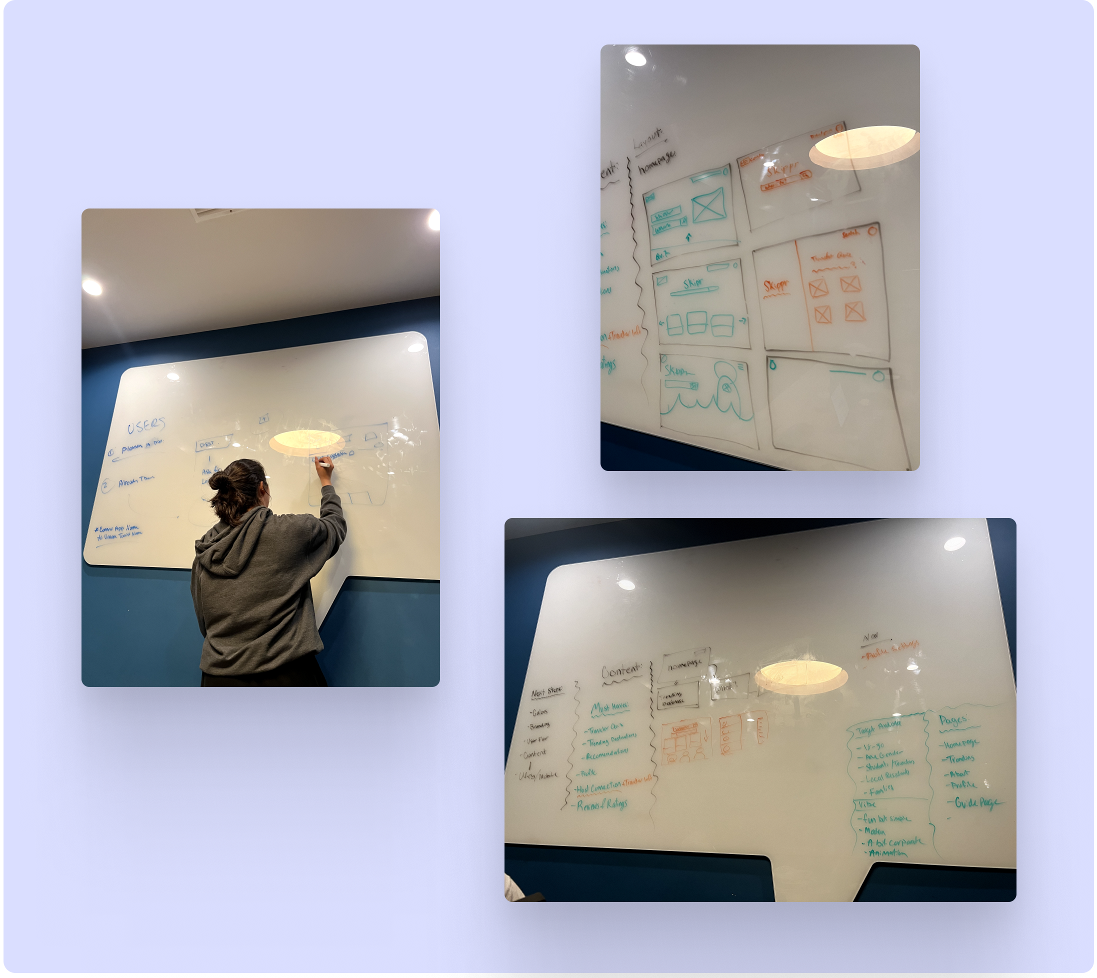
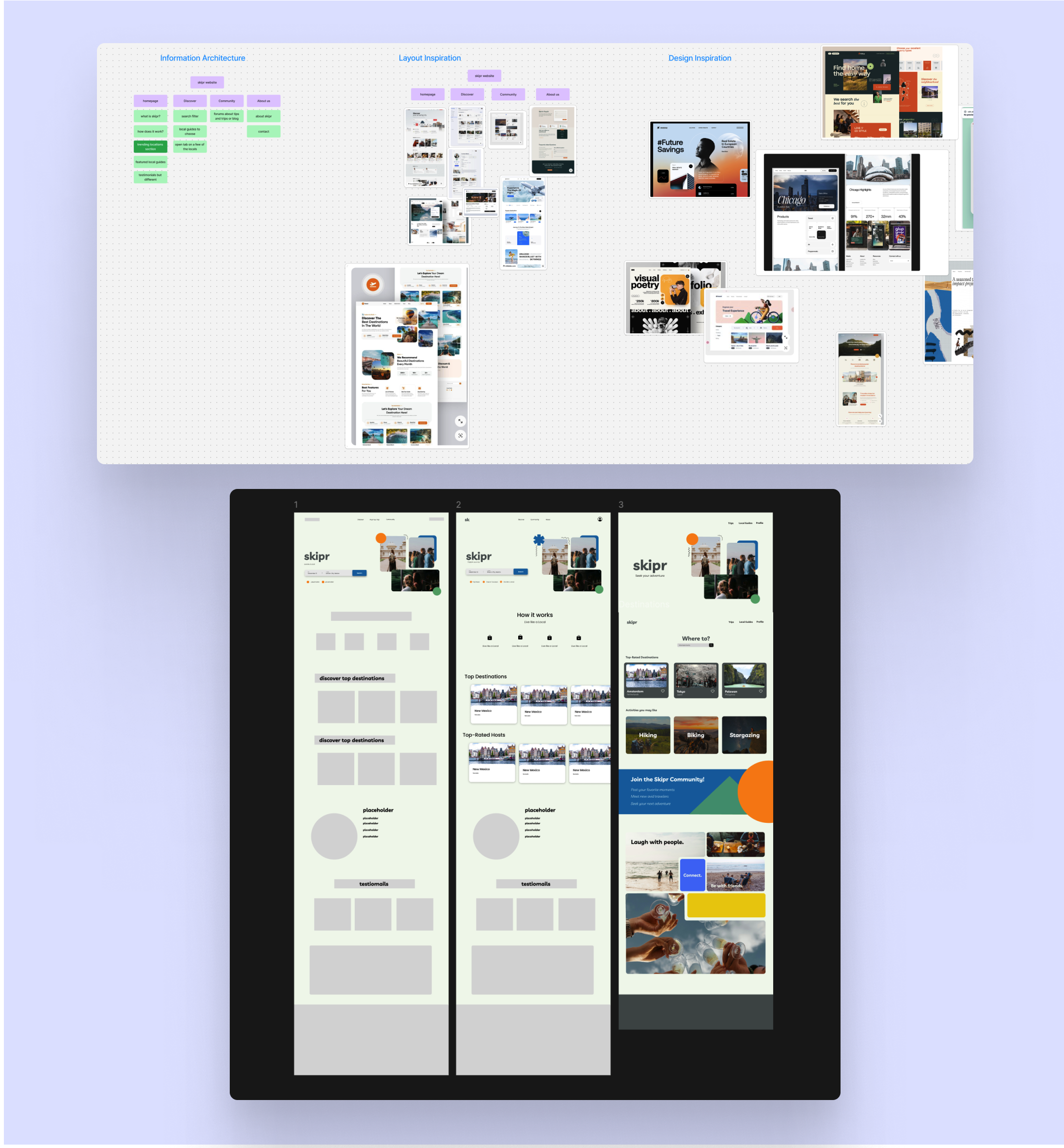
Once we had a clearer vision of what we wanted to bring to life, we moved on to gathering content, seeking inspiration, and exploring layouts to shape the experience. With the deadline for our entrepreneurship class approaching, we quickly ideated the first phase of Skipr through this wireframe (not super cute, but a vital step) to deepen our understanding of the branding and overall vibe Skipr needed
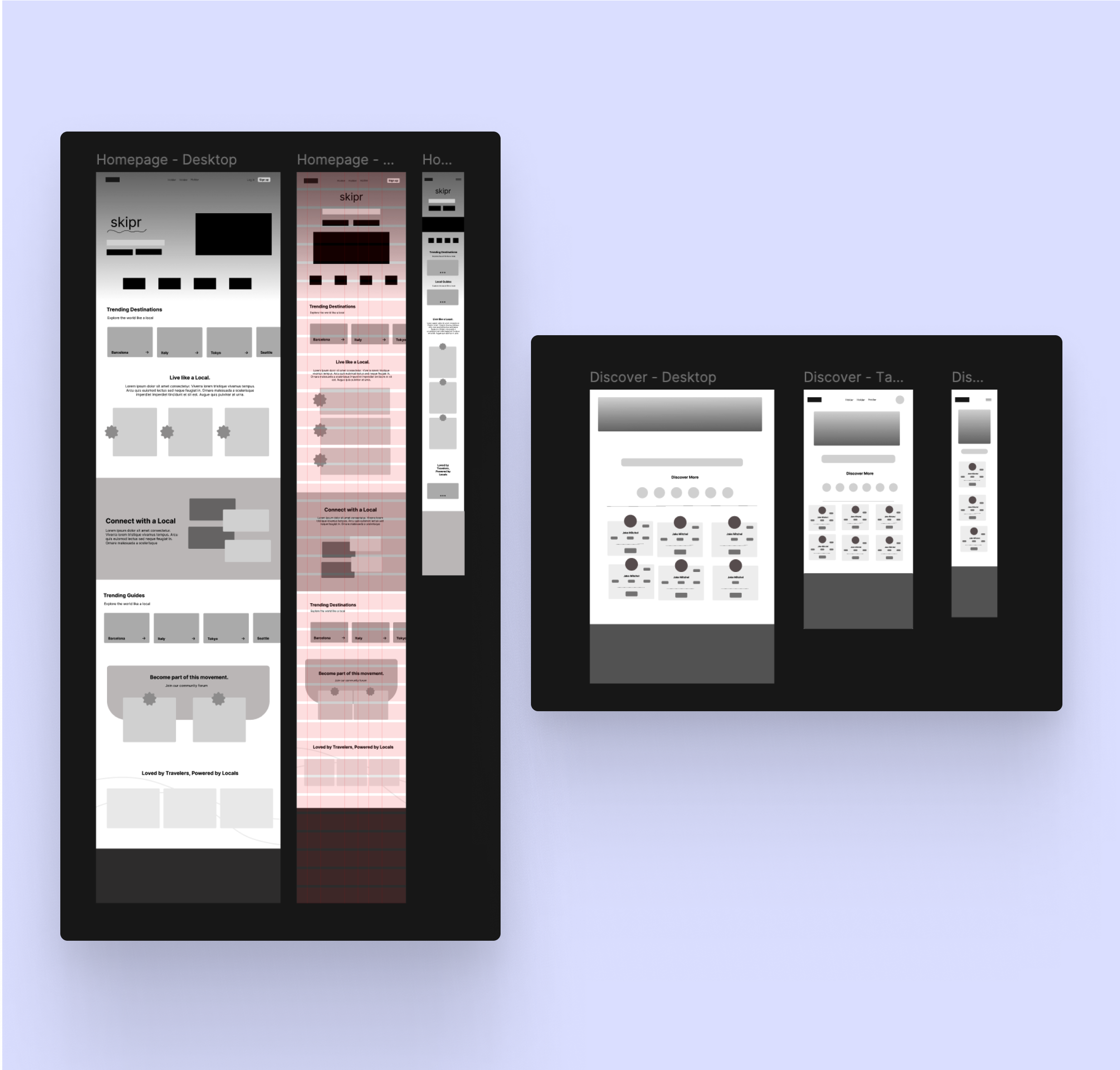
Our peers and mentors from class reviewed our work and gave us valuable feedback for the next iteration. They advised us to focus on one thing at a time to really nail it, which was a huge since we had been juggling so many aspects at once. We decided to narrow down and focus on perfecting the homepage. We wanted it to be as seamless and unique as possible, and these wireframes were the result of countless conversations about how to achieve that
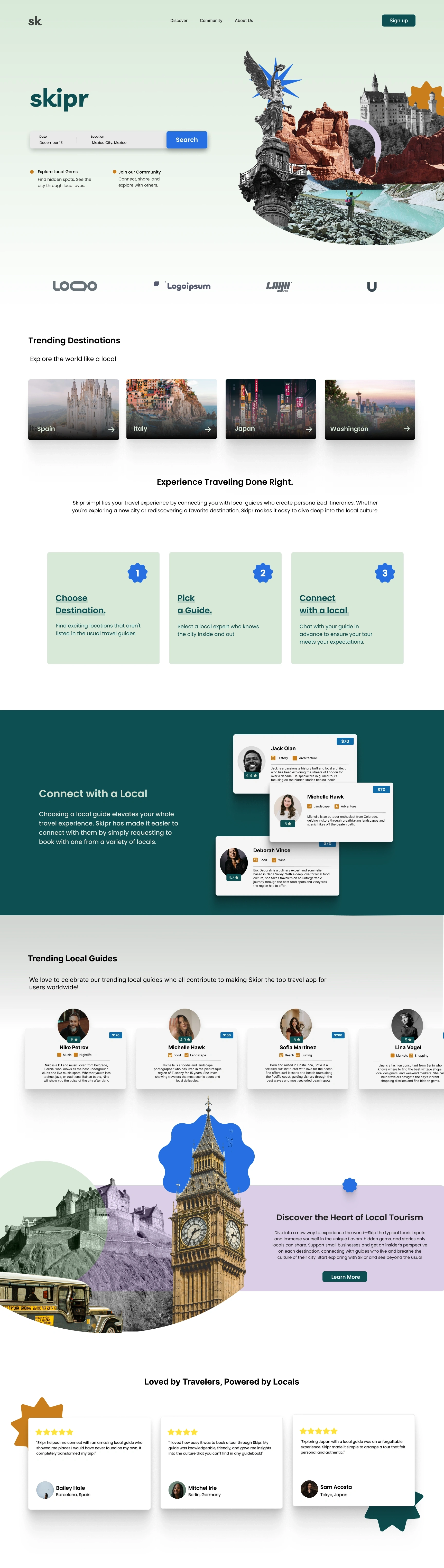
The vision for Skipr was always focused on being fun, adventurous, and visually appealing to our target audience. After several iterations, we landed on a design that gives users a glimpse into the world of Skipr. While the color palette and typography were finalized quickly, creating the right imagery took more time due to the complex layers involved in bringing the visuals to life.
The colors were chosen to reflect adventure, with vibrant tones that keep the design engaging. Paired with modern, clean typography, the text is easy to read and flows naturally, creating an enjoyable user experience.
The imagery is a collage of hidden gems and well-known spots from around the world. I added fun shapes to give the design a playful feel that resonates with our audience. The collage is meant to feel like a colorful trip—exciting and full of discovery. Playing with different hues and color burns, the imagery comes alive, allowing the colors to shine and creating one-of-a-kind visuals that captivate users.
This project reinforced the importance of using data to inform design decisions. I learned that effective UI design should be rooted in actual user needs, not assumptions made by the designer. Gathering comprehensive research is essential— each piece of data helps complete the puzzle before starting the design. Through this project, I gained valuable insight into how researchers think and approach building user-centered solutions.
I’m excited to continue expanding on this project. As this was a class project with each team member working on the homepage I see potential for further collaboration to build out additional features and refine the overall user experience.