
Case Study
This project was the final outcome of a semester-long course dedicated to redesigning Craigslist. I teamed up with three other classmates, and together, we focused on gathering as much data as possible to inform our design decisions. We conducted a range of tests—everything from user surveys to usability assessments—and then dove into analyzing the data to uncover insights that would shape our approach. The research process was intensive and took time, but it gave us a solid foundation to create something meaningful. From there, each team member put their own spin on the redesign, translating our shared insights into unique versions of Craigslist. This one is mine.
Information Design & Usability
UI/UX Designer
Figma, UX Research Tools
3 Months
Craigslist is a popular online classifieds platform where users can post and browse listings for jobs, housing, items for sale, services, and more. It operates globally, connecting people to local opportunities.
Craigslist’s interface is outdated and hard to navigate. Users struggle with its cluttered design, small text, and lack of visuals, which make it difficult to find information. The platform’s old-fashioned appearance also reduces trust, making a redesign necessary to improve usability and user confidence.
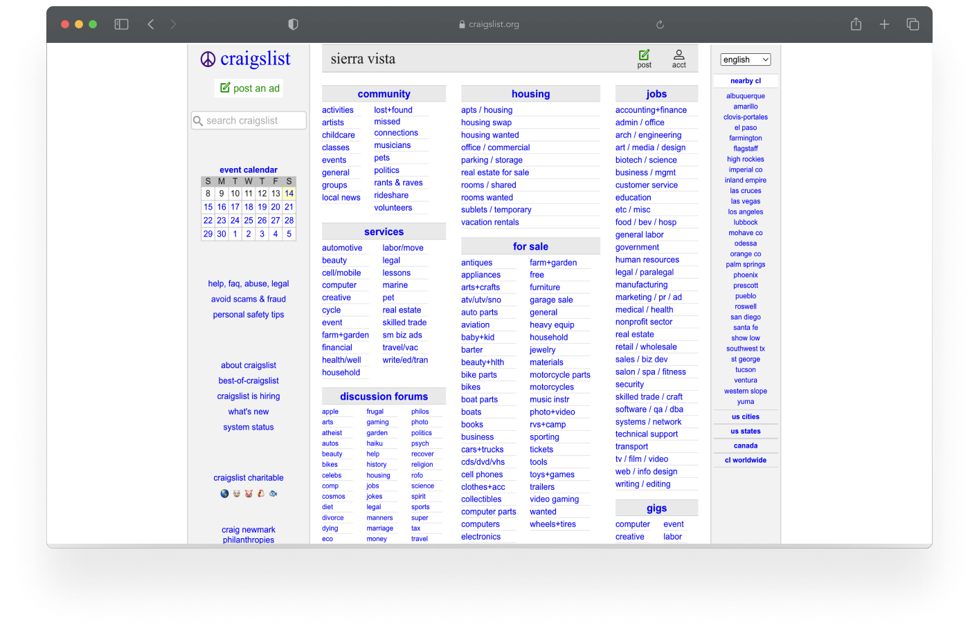
Craigslist's Original Website
Outdated UI: The design looks outdated, which lowers user trust
Cluttered Interface: The landing page overwhelms users with too much information
Poor Navigation: Users struggle to find key information due to disorganized links
Improve Usability: Simplify the layout and navigation for better ease of use
Modernize the Aesthetic: Update the UI with a cleaner, more contemporary look to build user confidence
Enhance Accessibility: Improve readability and usability for all users
Streamlined Layout: Created a clean design with clearer navigation and intuitive user flows
User-Centered Design: Used research insights to design for user needs and behaviors
Improved Readability: Increased text sizes and reduced clutter to make the interface more user-friendly
To fully understand the challenges users face on Craigslist, we conducted a series of research methods to gather both quantitative and qualitative data. This research helped uncover pain points related to usability, navigation, and trust, guiding the design decisions for our redesign.
We began by conducting a Google Survey to gather feedback from users on their experience with Craigslist. The survey focused on their browsing habits, how they interacted with the site, and their overall satisfaction. Insights from the survey helped us define our target audience and highlight recurring frustrations, such as confusing navigation and lack of trust.
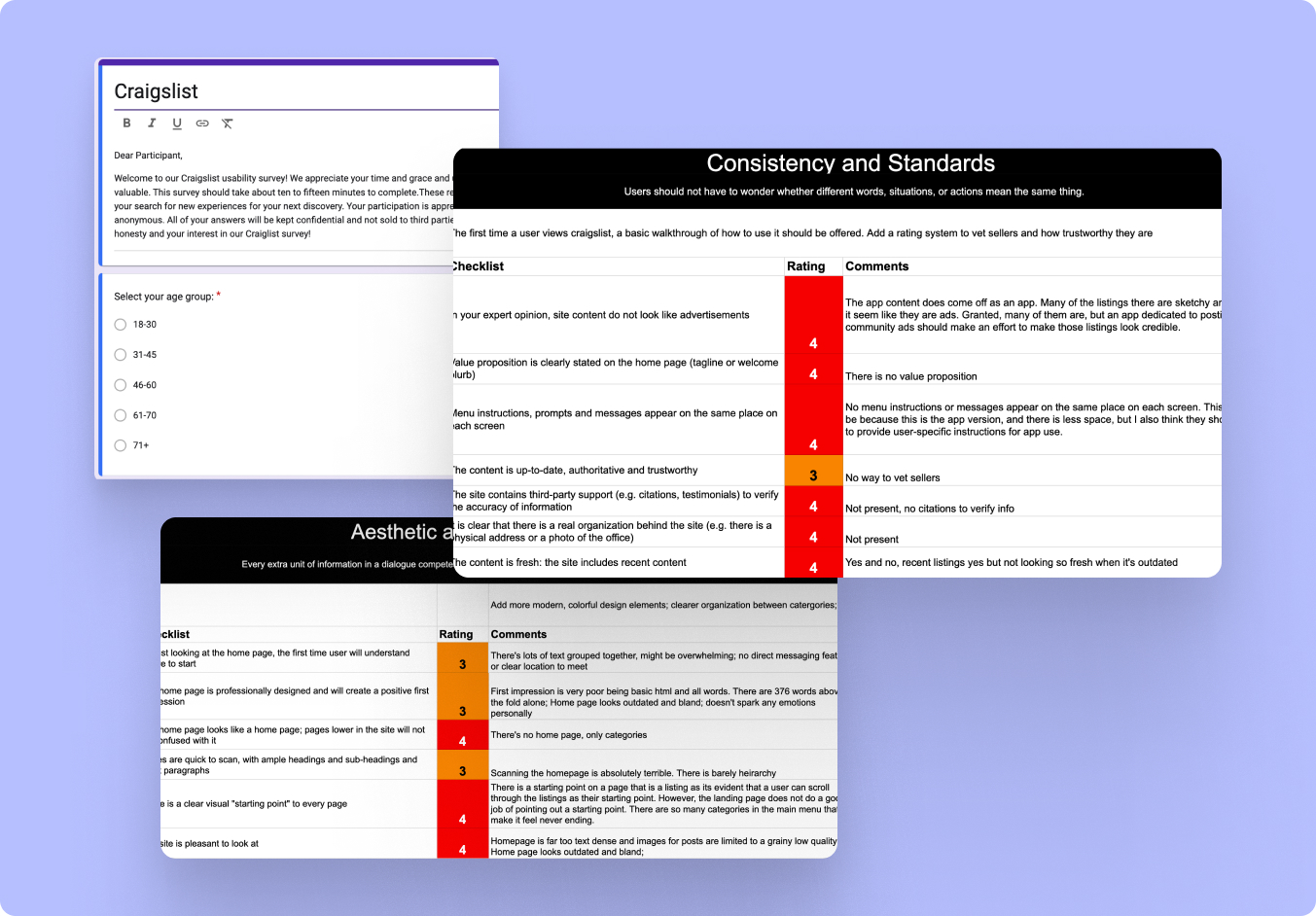
In addition, we performed a Heuristic Evaluation to identify usability issues on the platform. This evaluation allowed us to systematically analyze the site and document its weaknesses, especially in accessibility, layout, and user interaction.
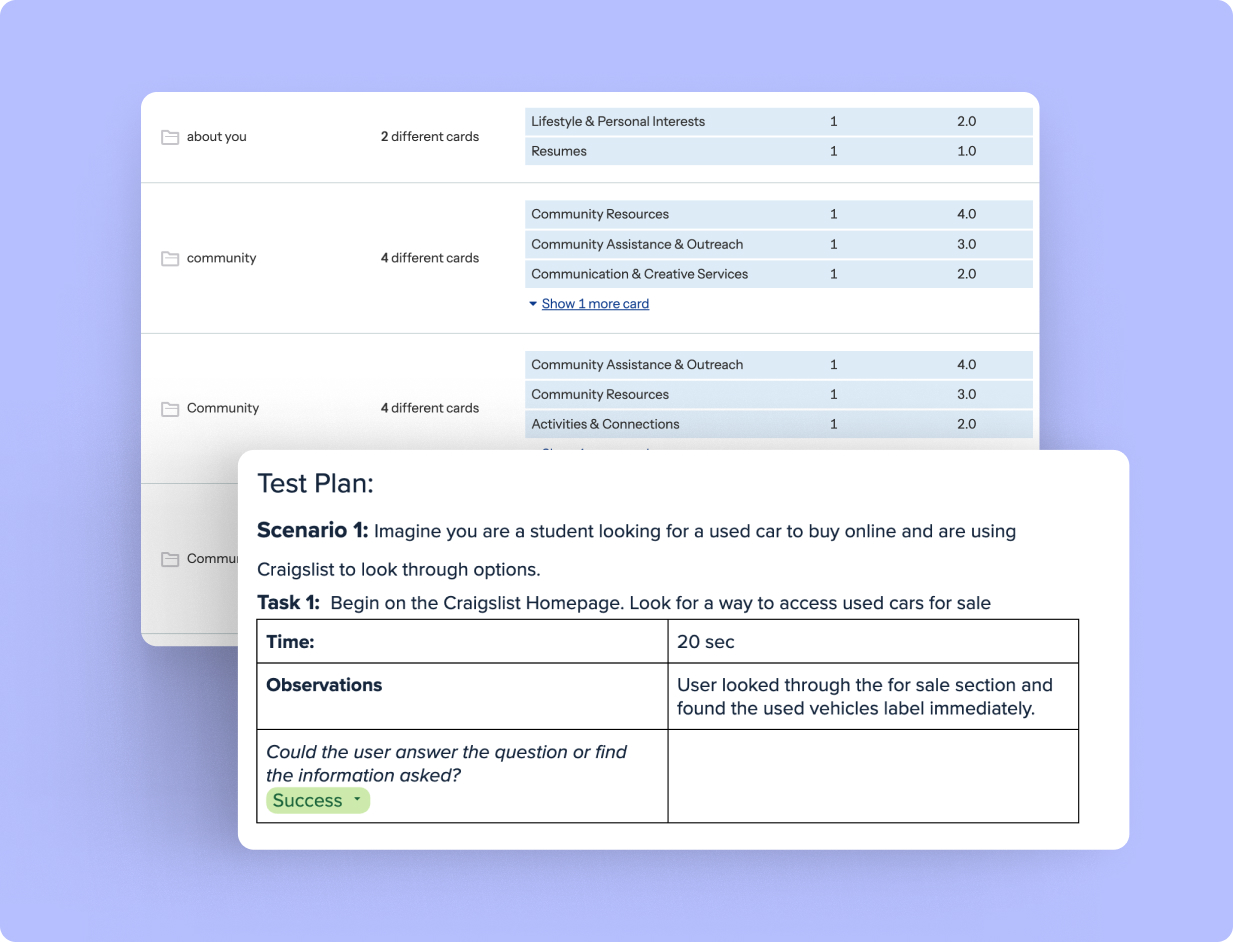
To refine Craigslist's information architecture and test the ease of navigation, we employed two complementary research methods. First, we conducted a Card Sorting test, where users were asked to group similar items and categories. This helped us identify how users naturally organize information, guiding our redesign to create a more intuitive structure.
Next, we performed User Testing Interviews, asking participants to complete specific tasks on the Craigslist site. This allowed us to observe how users interacted with the current design and identify common pain points, such as difficulty navigating and locating relevant listings. Combining these methods gave us clear, actionable insights into both how users expect information to be organized and where they face the most friction in their experience.
With our very in depth-research, these are the biggest pain points we found with this website.
45% of users found the user interface tricky to navigate and overwhelming
83.3% of users had something they disliked about the process of either selling or buying in Craigslist
66.7% of users expressed frustration while navigating through hyperlinked pages like FAQ, Abuse, and Legal to find safety information.
15% of users reported that they would have trouble understanding a seller's description and/or the help documents
25% of users disliked how jarring it was to move from page to page and how you lost the ability to see other options once you selected an option
Users also seemed to struggle to find what they needed in the navigation as they were presented with too many options
The design phase was driven by insights gathered during the research stage. Our goal was to create a user-centered, visually appealing, and highly functional experience that addressed the key pain points identified. This involved creating wireframes, developing user personas, and refining the information architecture to ensure ease of use, improved navigation, and an overall enhanced user experience.
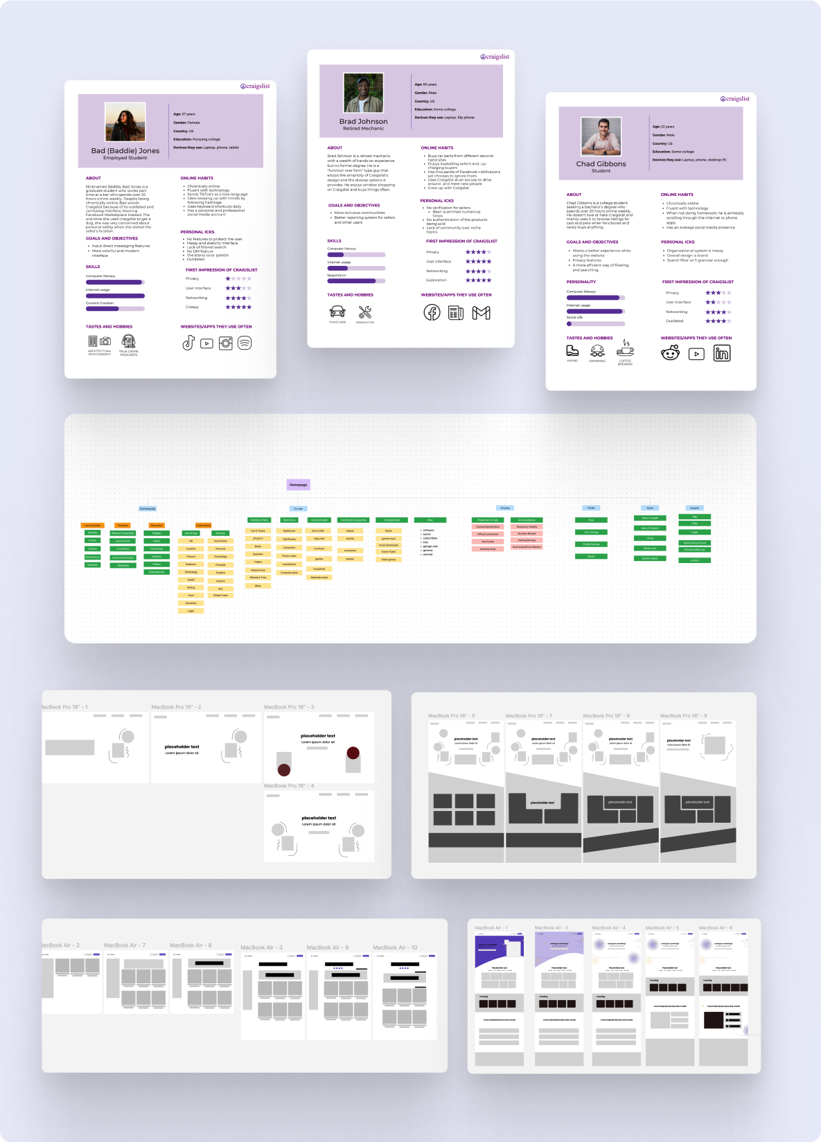
In this initial phase, we began by developing user personas to represent our target audience, focusing on their needs, behaviors, and frustrations. These personas guided our design decisions, ensuring that every aspect of the redesign addressed real user pain points.
Next, we created wireframes to map out the structure of the site, prioritizing clean layouts and intuitive navigation. The wireframes helped us focus on simplifying the cluttered interface and improving the overall user flow.
Lastly, we reworked the information architecture, restructuring the categories and content to make it easier for users to find what they’re looking for. This step was critical in addressing user frustrations with the confusing and outdated organization of Craigslist.
After weeks of planning, researching, and designing, this was the outcome of this project. All the team members worked on two individual pages using the informtion we gathered from users. With this redesigned, we attempted to make Craigslist a better website. Talk about design descisions here.
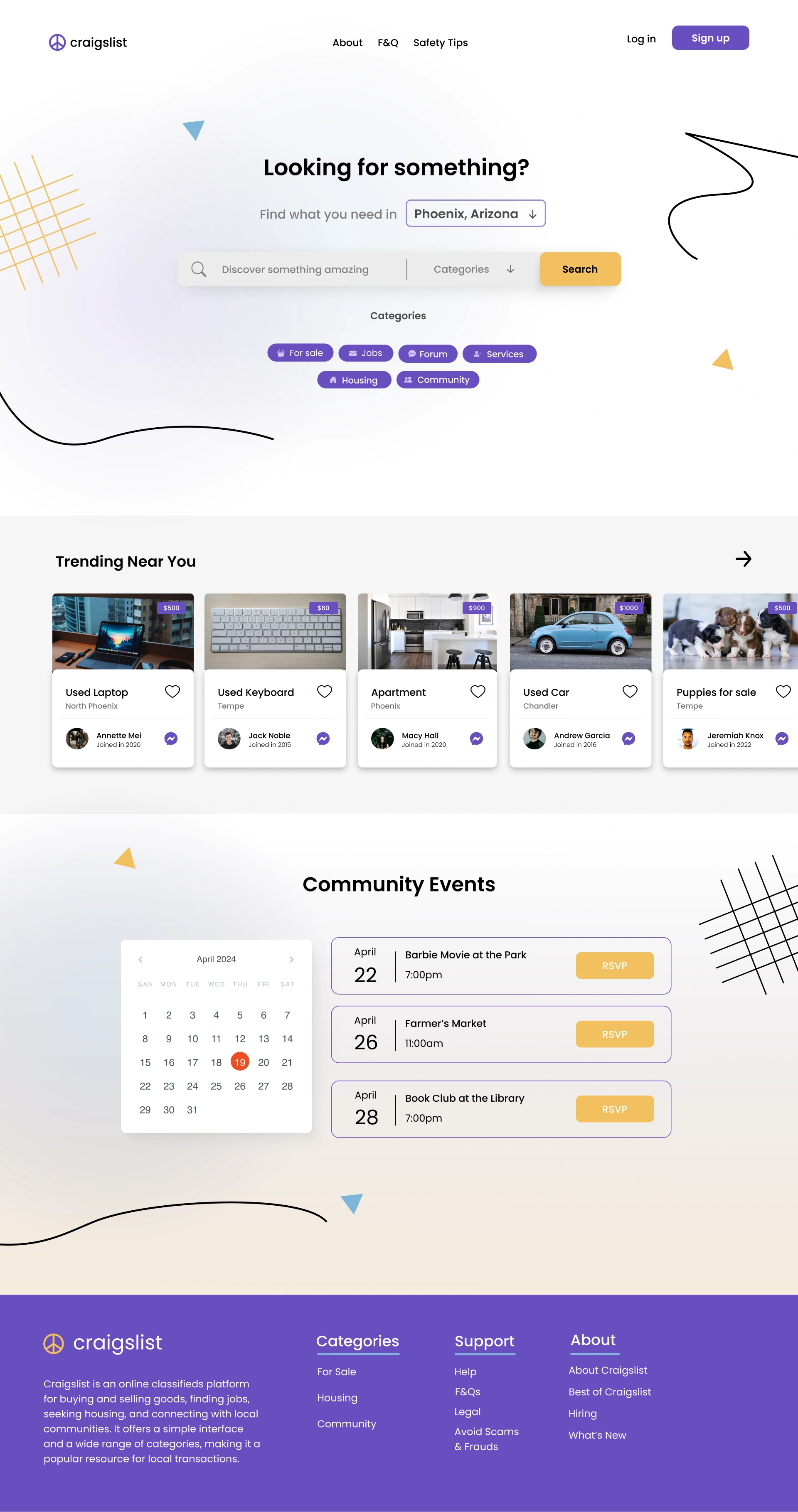
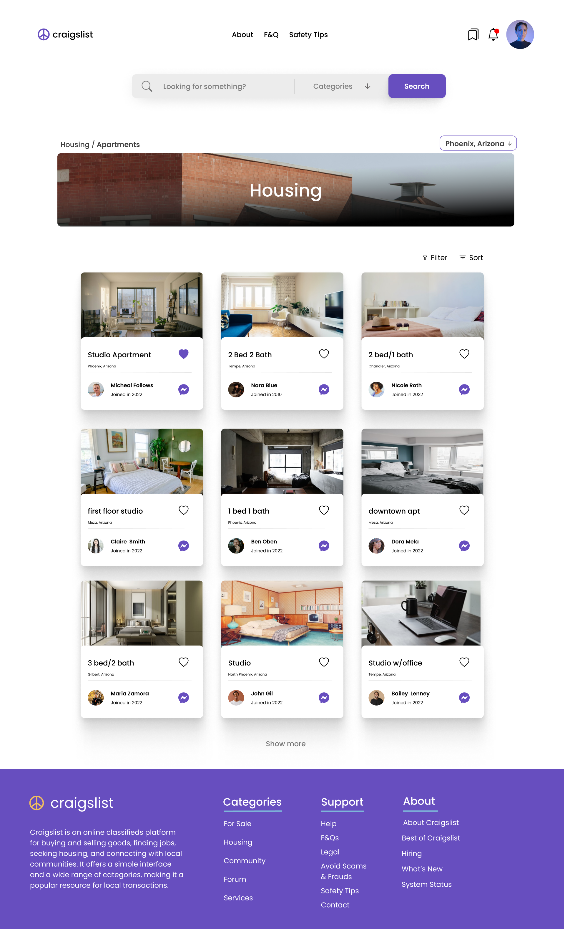
The redesign of Craigslist focused on enhancing usability and creating a visually appealing experience across the entire platform. I aimed to simplify the cluttered interface by introducing a cleaner layout, reducing text-heavy sections, and integrating visuals to help differentiate content.
Key features like the search bar were refined to minimize visual noise while preserving robust sorting and filtering options. I also ensured that essential actions—such as liking and messaging—were more accessible, allowing users to engage with listings effortlessly.
Imagery played a central role in modernizing the platform’s aesthetic and making it easier for users to navigate. By incorporating images into each listing and category, I was able to reduce cognitive load and improve the overall user experience, all while maintaining the simplicity that Craigslist is known for.
This project reinforced the importance of using data to inform design decisions. I learned that effective UI design should be rooted in actual user needs, not assumptions made by the designer. Gathering comprehensive research is essential— each piece of data helps complete the puzzle before starting the design. Through this project, I gained valuable insight into how researchers think and approach building user-centered solutions.
I’m excited to continue expanding on this project. As this was a class project with each team member working on two pages individually, I see potential for further collaboration to build out additional features and refine the overall user experience.


