Visual & Web Design
BRAVER Spaces Consulting is a firm specializing in diversity, equity, inclusion, and belonging (DEIB) solutions. They offer tailored change management strategies to help organizations create inclusive work environments that align with their mission and values. Their holistic, action-oriented approach focuses on fostering cultures where inclusion and courage are central to daily operations.
BRAVER Spaces Consulting
Web Designer
Wordpress, HTML/CSS, Adobe Creative Cloud
3 Months


Website Discovery: BRAVER Spaces needed a physical website to promote their services to new clients
Organizing Information: We needed to restructure the limited content to create more volume and depth, making it sufficient for a full, engaging website
Refine Identity: Give the visual identity a refreshed look by refining their content (logos, color palette)
Wordpress Configuration: Setting up the website layout on Wordpress by managing a template
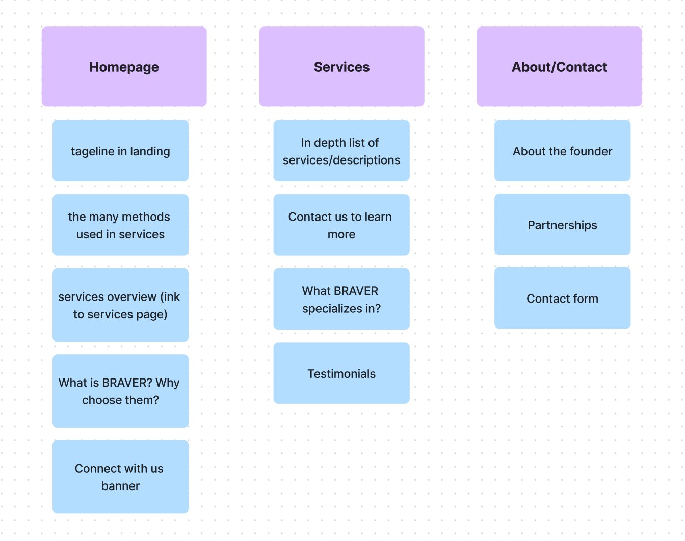
Information Architecture/Wire-framing: Configuring how to break the information apart to make it more engaging
Visual Refinement: Focused on design aspects (hierarchy, expanding color scheme, and cleaning logo)
The solution was a 3 page, fully responsive website that captured BRAVER's essence/mission. This website also focuses on accessibility and SEO marketing.
I began this project by breaking down the information provided by the business and identifying ways to expand it, making it more accessible and engaging for users. The content consisted of general business guidelines and client presentations. A key part of this process was determining the best section for each piece of information, ensuring a clear structure that made the website easy to navigate while keeping it visually appealing and user-friendly. Balancing engagement with the proper layout was essential to achieving the right flow for the website.


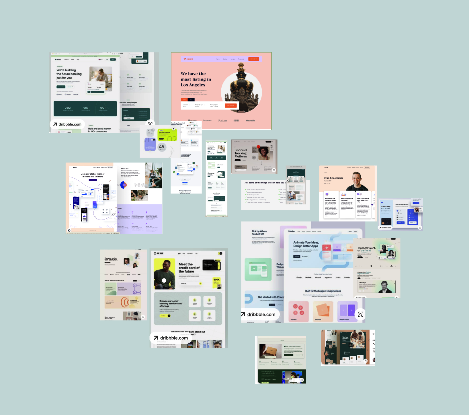
After determining what sections would go on each page, I began gathering inspiration and creating a mood board. For me, mood boards are essential in guiding the visual direction of a project. It was important that the website felt simple, clean, modern, and professional. Exploring different inspirations helped me plan how I wanted to organize the information without focusing too much on the visuals just yet. This stage helped me think through the layout and flow before diving into the final design elements.

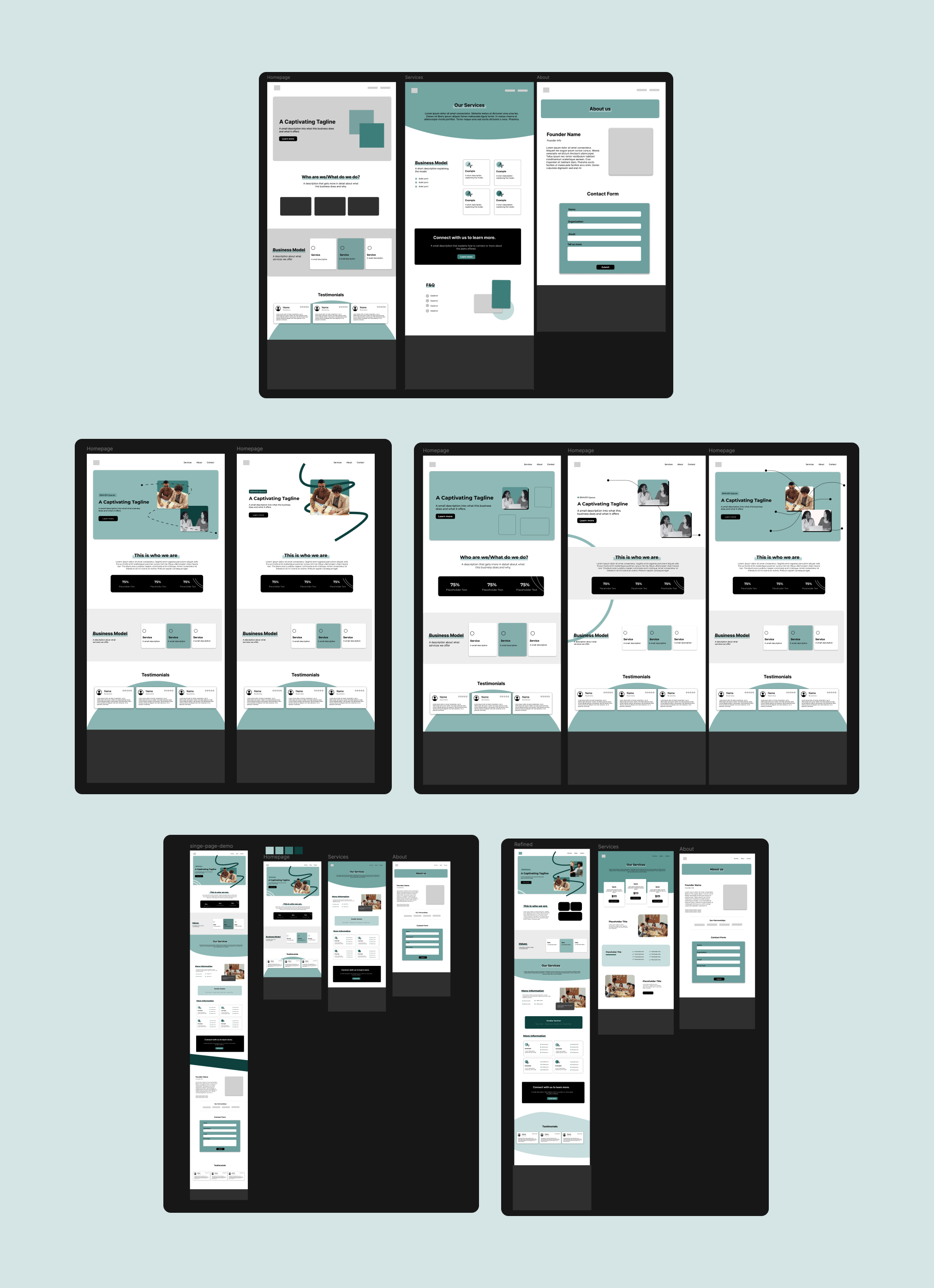
Once I had a clear idea of the project’s layout and requirements, I started wireframing. The top images show the first concepts I put forward. I focus on the layout and content of a website before developing the visual identity. Throughout this phase, I played with different ideas and refined them through feedback sessions until the client and I landed on a design we both liked. This process involved a lot of iterations and adjustments before settling on the final theme.
The client provided one color to work with. To make the design more visually engaging, I expanded the palette to include various shades of the same color, adding depth to the project while maintaining the client’s original vision.
The logo, initially created by the client, needed refinement in Adobe Illustrator. I also developed a type scale to improve readability and ensure consistent typography throughout the project. This helped create a cohesive and professional visual identity.
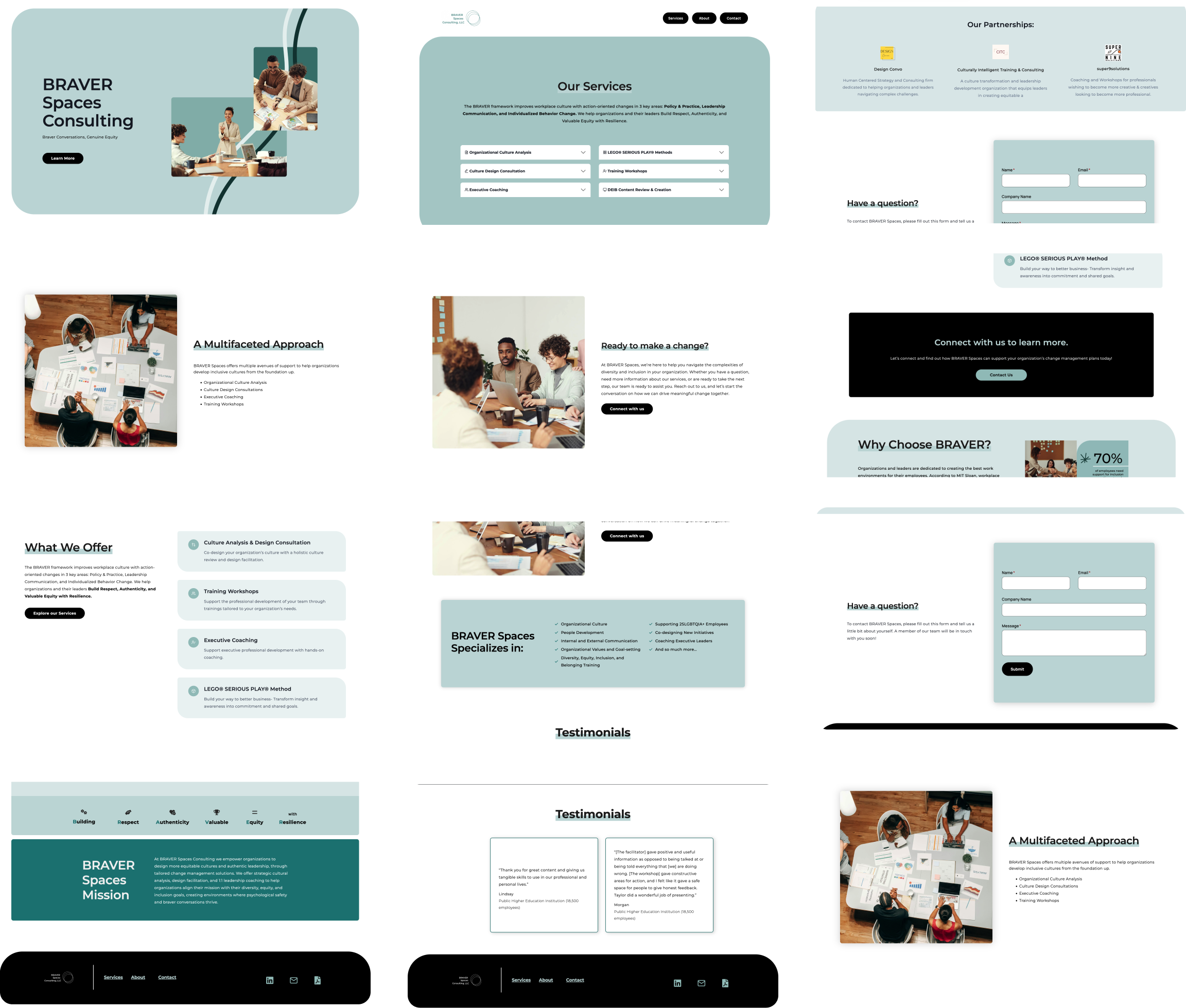
After months of design work, these are the final versions of the website. We focused on creating a modern, cohesive feel across all three pages, incorporating fade-in animations to enhance user interaction and create a smoother experience. The final design strikes a balance between visual appeal and usability, ensuring the site feels both engaging and professional.

This project enhanced my ability to adapt to pre-existing content and platforms while maintaining a strong visual identity. It reinforced the importance of wire framing as a tool for communication and collaboration, reducing the risk of scope creep. I also gained deeper insights into WordPress plugins and coding custom elements, all while honing my visual hierarchy and responsive design skills.
Overall, the Braver Spaces project was a rewarding opportunity as I was able to take away so much from it. It not only challenged me to refine existing visual identities but also expanded my expertise in creating accessible, engaging user experiences.