
Visual Designer
1 month
Adobe Illustrator, Indesign, and Photoshop
Overview
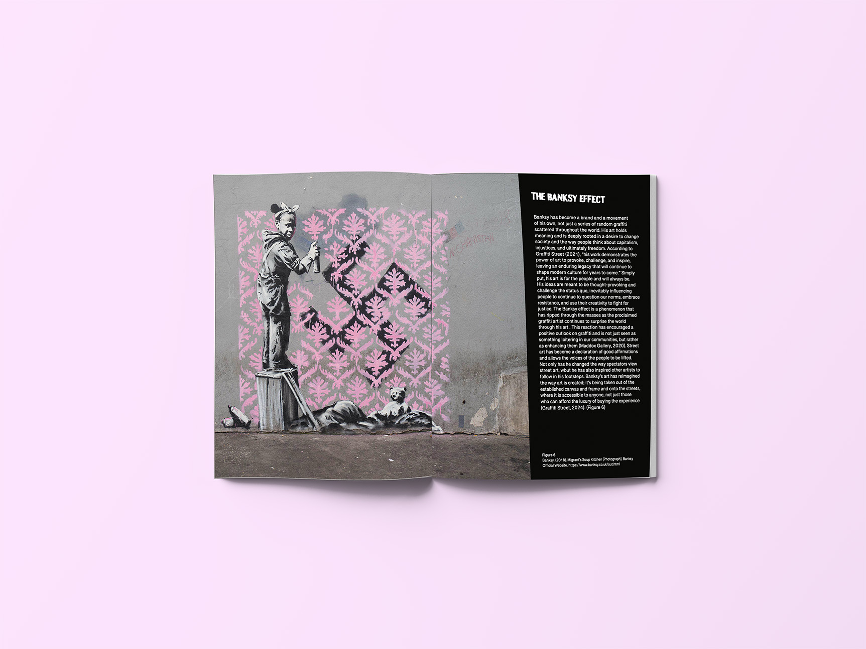
This project was a hand-produced magazine created as part of a collaborative class assignment, working alongside a partner class responsible for management and publishing. Centered on the artist Banksy, the magazine combined extensive research, written analysis, and visual design to reflect his life, works, and inspirations. My responsibilities included researching the artist, writing an analytical essay, and designing the full magazine layout - including the logo, custom illustrations, and cover. The final deliverable consisted of eight spreads (16 pages) featuring curated images and two original illustrations.
Challenge
While the assignment required creating a magazine about Banksy, the real challenge was designing something that authentically captured his artistic identity. Beyond simply presenting the written analysis, the design needed to capture Banksy’s distinctive style without replicating it directly. This required deep research, thoughtful interpretation, and deliberate design decisions to create a publication that felt true to Banksy’s tone and influence while remaining original to the project.
Phase I
My initial research explored the roots of street art and Banksy’s evolution, symbolism, and public influence to build a foundation for both the essay and the magazine’s visual direction.
Banksy’s anonymity centers the focus on message over identity.
His simplicity and wit amplify the impact of his social commentary.
His work challenges traditional views of graffiti and public art.
Phase II
Much of the ideation process began by revisiting my research. I knew my design needed to be rooted in the graffiti aesthetic, as that would represent Banksy most accurately. From the start, I established creative constraints to stay within the essence of his style. Using the information gathered during the research phase, I set up parameters that helped me design more intentionally and creatively, ensuring I didn’t stray from the project’s scope.
First logo design
The process began with creating a logo inspired by Banksy’s work. This was one of the most challenging components, as logos require simplicity, originality, and a strong foundation. What started as a few simple words and a nod to Banksy’s infamous red balloon eventually evolved into a logo that better reflected the texture and feeling of street art. Feedback from my peers and professor played a key role during this stage; it taught me the value of exploring ideas that initially feel out of reach, as those often lead to the most unexpected and successful outcomes.
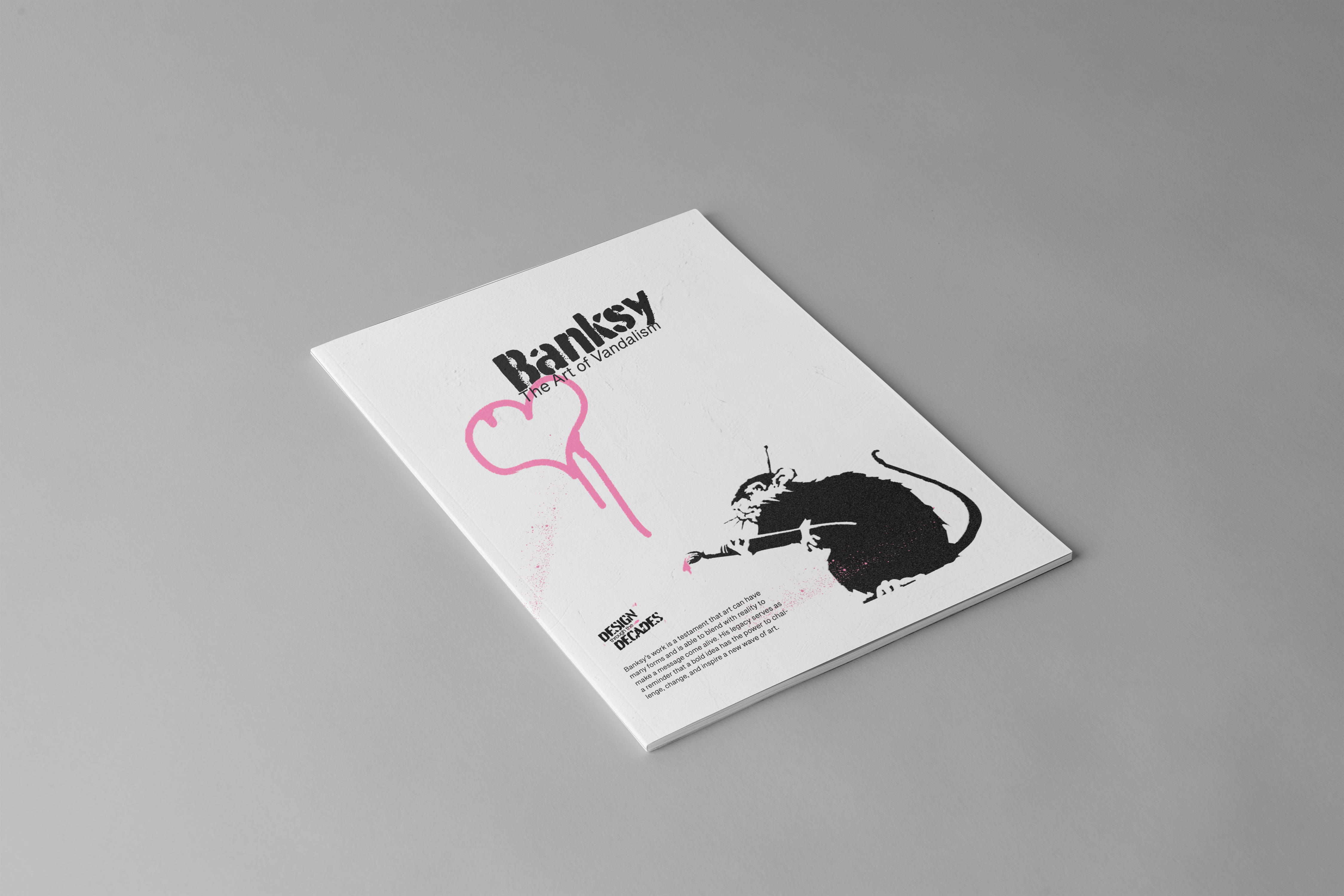
For the magazine cover, I designed five different front and back variations using grid layouts such as 3x3, 4x5, and 6x5. Experimenting with these structures allowed me to explore unconventional stylings that sparked new ideas. The covers were minimalist yet interconnected with Banksy’s symbolism. I incorporated wall textures, bold graffiti-like typography, one of his iconic artworks, and added a subtle pop of color to draw focus to the imagery.
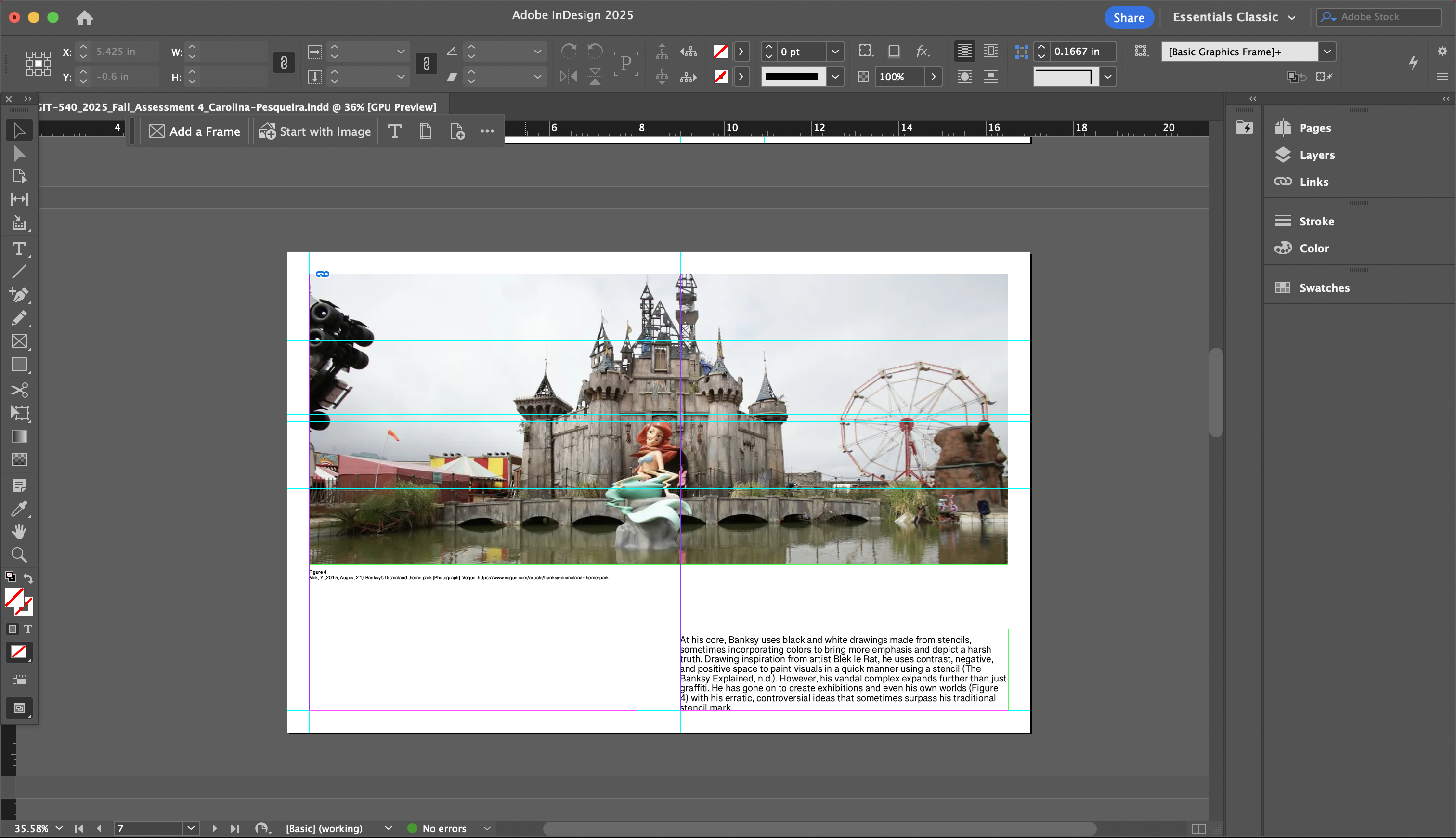
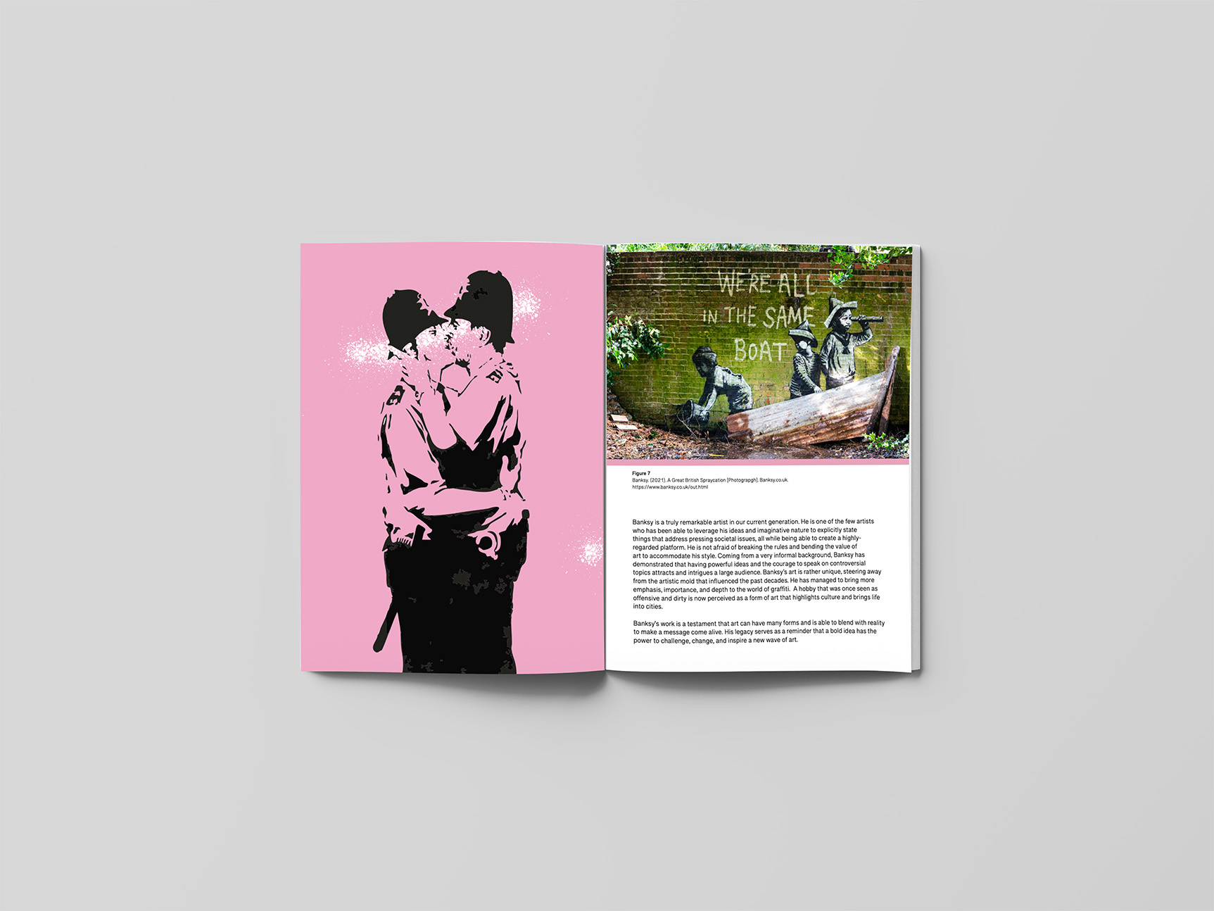
For the internal layouts, I continued experimenting with grids to find the right balance between text and imagery. I kept the overall design barebones and striped back, emphasizing on Banksy’s art.
Phase III
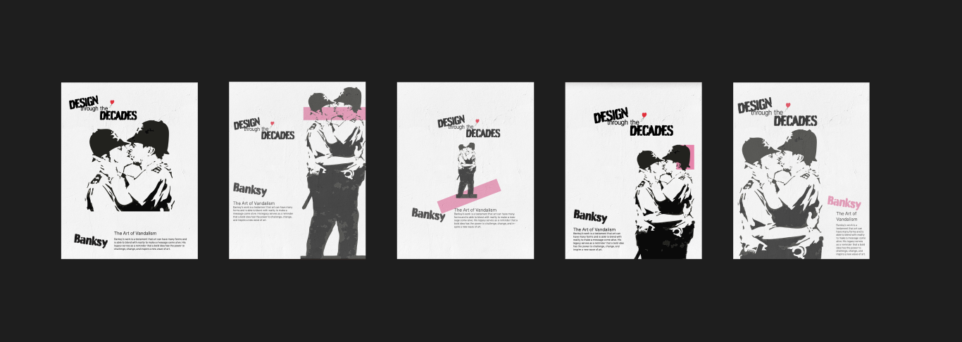
A key part of this phase involved defining the visual direction of the magazine, which meant establishing a cohesive aesthetic that reflected Banksy’s work while remaining engaging for readers. I focused on a minimal but bold color palette of black, white, and pink, chosen for its strong contrast and its ability to echo the artist’s artistic tone. To reinforce the theme, I incorporated graffiti-inspired typography and decorative elements consistently across the spreads. During this exploration, I created five potential cover designs to test different ideas and determine which best captured the magazine’s tone.
A key part of this phase involved defining the visual direction of the magazine, which meant establishing a cohesive aesthetic that reflected Banksy’s work while remaining engaging for readers. I focused on a minimal but bold color palette of black, white, and pink, chosen for its strong contrast and its ability to echo the artist’s artistic tone. To reinforce the theme, I incorporated graffiti-inspired typography and decorative elements consistently across the spreads. During this exploration, I created five potential cover designs to test different ideas and determine which best captured the magazine’s tone.
The magazine project was one of the most complex design projects I have worked on. Thisprocess was lengthy and complicated at times, and I had to consider many factors. The firstversions of this magazine were not very good. I was working with a mindset that did not allowfor my ideas and creativity to flow. After receiving feedback from Professor Storm, I realized Ineeded to approach this design differently. My initial question was what Banksy would do with aproject like this? This question posed more complications than it did solutions. I began lookingat this magazine through a different lens, an admirer's one. This mentality loosened myconstraints and allowed my ideas to come more easily. Through rounds of iterations and edits,the design was starting to feel more cohesive and "alive". I learned that feedback, especiallyfrom other creatives, was crucial in identifying imperfections and understanding what wasn'tworking. Overall, I completed this project with a design that I am genuinely proud of, and Ilearned many valuable lessons along the way. Although it was challenging, it pushed myboundaries in terms of creative thinking and provided me with the space to explore my skills inAdobe.
